https://www.absentmammoth.org began in a much different form all the way back in January. Getting it to where it is today took dozens of hours and occupied most of my free time for several months. Making this website gave me something positive to focus on and has been a sick learning experience. I pushed myself more while working on it than I have with anything else in ages.
In January, I got it into my head that self-hosting a server would be fun. 'Why not put Ubuntu Server on an old laptop. I'll make a little website on it and do some local network stuff with it, just to prove I can. And I'll do it all without a GUI, duh.'
Everything I read about self-hosting made it sound easy. You just get your LAMP stack going and then you do a reverse proxy and throw Nextcloud and Ghost on it. Unfortunately, the fun of computers is that there is often more than one way to do things, which left me confused. LAMP stack... but then I learned about nginx. Do I use that or Apache? Why is composer not working out of the box for me? There are like a bazillion ways to setup a reverse proxy and I have no idea which one to do! Are they interchangeable? Actually, no! I reinstalled Ubuntu multiple times, because a clean slate was easier than trying to figure out whatever bullshit I had brought on myself. But, it wasn't all bad. I learned a bunch of terminal commands, the file structure of Linux, ssh keys, and... Vim (just kidding, I used nano). I also gained some insight into how I learn best. Still, setting up my own server became more of a headache than it seemed worth. Every time I would get Nextcloud working, going forward one step beyond would break it. Half the guides I found are for only one piece of the puzzle -- there are few all-in-one guides online that aren't either hundreds of pages long textbooks or software developer docs that only apply to their own software (duh, of course that would be the case). And, because of how Google works, clicking on a site's bad guide means you just get more trash from that site later when you try to find the solution to another problem.
So, I gave up after a few nights and many hours trying to figure all of this out.
Part of what pushed me to try self-hosting was https://indieweb.org. IndieWeb is not a huge community. It's a few dozen nerds passionate about controlling their identities online. And, in looking around their community, it seemed like one difficulty level below a self-hosted server would be to use Github Pages to host a website made with a static site generator. The easiest generator to use with Pages is called Jekyll. But Jekyll's user-made themes just... look old, like they originated on Blogger. When I first looked at static site generators, I figured I would just use someone else's theme and maybe make a couple small changes if I felt like it. Trying to find a cool look for a site meant trying out many different static site generators. I settled on Hugo, because I saw Jamie Tanna's site https://jvt.me and thought it looked really good. It didn't hurt that Hugo is much simpler than something like Gatsby. (That said, my goofy digital garden placeholder @ https://garden.absentmammoth.org is made with Gatsby. However, I did not play around with Gatsby until I had my main site about where I wanted it, and I found it incredibly frustrating to work with as a novice.)
So, at this point, I've got something I think looks pretty -- Jamie's site -- and no idea what to do next. I didn't know how to use git (and even now I only understand the basics), how Hugo works or much of what it was even doing when it 'generated' a site, and what I remembered of CSS from my teens felt so dated when I would look at Jamie's site in vscode. It took me weeks of trial and error to even develop the language necessary to walk through what I wanted to do with the site in my head, not to mention how to verbalize the questions I had about git, CSS, and Hugo when prowling Google for help.
At this point, we're in early to mid-February. I was in the process of starting a new job after coming off of what felt like a humiliating job loss and eyeing news about the coronavirus, which looked awfully bleak. (And hey, wouldn't you know it...) But spending time on the website was fulfilling. I was learning things and able to see if not improvements, at least changes when adjusting the site's html and css.
I have always enjoyed working with my hands and seeing the Fruits of My Labor, but I had somehow forgotten making something was even a thing you could do. Working on the site brought back the nostalgia of things as simple as Lego blocks to more complicated projects like building a barn and running fence for a horse pasture. Damn, you can just go out and make stuff? Wild. I always forget that I once put a new roof on a duck shed until I am making something else and remember, 'Oh yeah, that was rewarding and I should make more stuff.'
At some point, probably around mid-February, I became completely obsessed with working on the site. I understood enough about git and Github Pages that I could spend more of my time on the actual project. While I had initially planned to use Jamie's theme (he now has a new one and I am not going to dig through his Gitlab to find the old one right now), I came to realize it did so much that I did not need or understand. The site I had taken from him included various possible copyright licenses on each post, a whole bunch of IndieWeb features I did not know what to do with, and html and css I did not know the purpose of.
In my hubris, I thought I could just delete whole swaths of the site and anything I did happen to break would be easy enough to fix. Not so! It's not easy to fix something whose fundamentals you don't understand.
The fundamentals of Hugo
Hugo renders markdown as html. This is simple. When I write a post called how-to-see-project.md (this one) and run the hugo command, the markdown post will turn into an html page in a separate folder on the computer (which I then upload to a Github repository that points to the site url). What I did not understand at the time is... anything else about how Hugo works. The really important stuff, from a presentation perspective, is in the layouts folder. The layouts folder is like the giant felt board of your site and its files and subdirectories are like little pieces of felt you can stick on your site in different places. For example, https://www.absentmammoth.org draws on the baseof.html, which says:
1<!DOCTYPE html>
2<html lang='{{ .Site.LanguageCode | default "en" }}'>
3    {{ partial "head.html" . }}
4    <body>
5        {{ partial "header.html" . }}
6        {{ block "main" . }}{{ end }}
7        {{ partial "footer.html" . }}
8    </body>
9</html>
The squiggly stuff is asking Hugo to grab the felt pieces (called 'partials') header.html and footer.html and place them at the top and bottom of the site, respectively. {{ block "main" . }} is the type of bullshit I just did not understand about Hugo for the longest time. In this case, "main" is a block defined in other html files and stands in for all the content on the main page that isn't in the header or footer. The . is an element in a range. If I remove it from the code, the site will not even load, because... no elements in the range.
(And, really, just about everything I learned in making this site came from 'removing a line of code and seeing what happens.')
These few lines are very simple, which is why I got so frustrated with Hugo again and again. It's very simple, period! But it has all these little intricacies that literally meant nothing to me going in. {{ block "main" . }} is a day at the beach compared to this total bullshit from head.html:
1{{- if .IsHome }}
2 <meta name="description" content="{{ .Site.Params.Description }}">
3 {{- else if .Description }}
4 <meta name="description" content="{{ .Description }}">
5{{- end }}
6
7<title>
8{{- if .IsHome }}{{ .Site.Title }}{{- else }}{{ .Title }} · {{ .Site.Title }}{{- end }}
9</title>
Even now, I only vaguely understand what the various functions and variables being used here are saying. I have read through the docs multiple times and am still relying on context clues, like the <title> tag, to piece together what's happening.
I avoid Hugo's functions and variables as much as possible, but I had to get the basics to understand how to make the css and html changes I wanted.
Hugo's layouts folder makes managing the site's css and html easy, because you can play with one piece of felt at a time. For example, my thank you page is a markdown file shaped by the additional-thanks-to.html file:
1{{ define "main" }}
2
3<div class="credits-style">
4    {{ partial "additional-thanks-to.html" . }}
5        {{ .Content }}
6</div>
7
8{{ end }}
The div class here (credits-style) allows me to style the text 'this site is made possible with support from' on the additional-thanks-to page and the {{ .Content }} that makes it up (the content comes from the 'additional thanks to.md' file). This page's appearance is largely handled by the _credits.scss file. _credits.scss lets me put in all the fancy arrows and make other adjustments specific to this page, so that other parts of the site don't have to have the same rules. Some of that file can be seen below:
 1.credits-style {
 2...
 3  ul {
 4    list-style-type: none;
 5    sup:before {
 6      content: '[';
 7    }
 8
 9    sup:after {
10      content: ']';
11    }
12
13    sup {
14      font: 100 0.7rem $header;
15    }
16  }
17
18  > ul > li {
19    margin-bottom: 0.4rem;
20  }
21
22  > ul > li:before {
23    content: '\232A';
24    vertical-align: text-top;
25  }
26}
Where the fun begins
To make the site, I relied a lot google searches, the Hugo docs, Mozilla's amazing css/html docs, and my browser's 'Inspect Element' feature to learn the technical aspects of the site. Making this site introduced me to the concept of Not Having the Vocabulary. I was not able to think: 'Ah, you know what I need here? A css grid.' I didn't even know css grids existed! The hardest parts of this project have all come from an inability to verbalize or imagine things I either didn't know the terminology for or never would have thought to be things.
In a physical sense, I know what a grid is. And a css grid makes intuitive sense, but I had no idea it was even an option until I began fumbling around with how to space the different parts of each post's title information. I wanted every post to be divided up in such a way that I could have a table of contents in the left corner, the title in the middle, and the tags in the right corner. I assumed there was a way to do this, but it took some playing around with search terms to find out exactly how.
A portion of the grid in Absent Mammoth's _posts.scss
 1.individual-post {
 2	display: grid;
 3	grid-template-columns: 25% 50% 25%;
 4	grid-template-rows: auto;
 5
 6	> .toc {
 7		grid-area: 1 / 1 / 1 / 1;
 8		justify-self: start;
 9		font-family: $header;
10
11...
12
13	> .post-meta {
14		@extend a;
15		grid-area: 1 / 2 / 1 / 3;
16		text-align: center;
17		margin-bottom: 0.8rem;
My brain naturally wanted to separate css and html from the physical world. 'I am typing all of this into a computer, so it is shapeless and has no form.' But css grids and Inspect Element disabused me of this unconscious thought process. The word 'grid' is almost the most literal physical foundation you can think of, right?
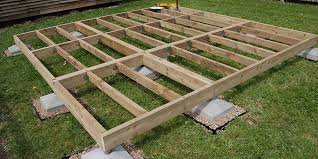 the foundation of some British guy's shed. what's he going to put in the shed?
Inspect Element is a fantastic tool. With Hugo's ability to serve and update a site at localhost:1313, any change I make to the site is immediately viewable in my browser. This might not seem like a huge deal, or maybe it seems redundant. You just changed the code, why do you need to verify it in the browser?
When working with Jamie's code, what I quickly found out is that changing one or several lines of css (or, worse, messing with files in his layouts folder) did things I didn't expect, or didn't do things I expected. Element inspection became most useful when I was at my wit's end over the site's margins and padding.
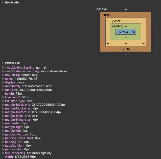 a lifesaver: inspect element
Making sure that margins are consistent throughout the site is a real pain in the neck unless you can see the actual numbers being used. Even when I thought I had the css structured correctly, it would appear visually different than I expected on the demo site. Inspect element lets me see where the site is getting its margin numbers from in the css, and how the numbers 'look' on the page.
Once I began to learn what tools and resources were available to me, things began falling into place. Still, I lacked any sort of grand unifying theory of css, or design, or site organization. Jamie's code was split across several individual .scss files. Why? I had no idea. So I put all the css into a single .scss file. Why not?
It turns out that doing this makes keeping track of what's in the css difficult. 10 individual .scss files combined into one produces hundreds lines of code. It's not impossible to understand what's going on, but it is visually overwhelming. It's like having all of your files in a single filing cabinet -- no folders, just your taxes, important mail, records, and documents all in one spot, intermingling. When you split the code out into several files, it becomes much easier to see what goes where. This seems like a small thing, and it is, but it was only through better organizing the code that I could get to the next step: optimizing the site's css.
I began to worry that I had contradictory or redundant css in the site. And while loading time is not relevant for such a barebones website, as a matter of craft I wanted to create the cleanest code I could. And while I still have a ways to go in that direction, googling around gave me my first clue: rscss. rscss is the kind of thing I love in anything: a framework for what I'm doing. Even if I haven't implemented it quite how it should be (I'm bad at following directions), it got me much closer to where I wanted to be. Through it, I learned how to cut down on unnecessarily wordy, long css and how to target and name specific elements rather than exposing swaths of the site to competing rules.
It's not perfect, but something as simple as this was revelatory to me!
 1	> .post-meta {
 2		@extend a;
 3		grid-area: 1 / 2 / 1 / 3;
 4		text-align: center;
 5		margin-bottom: 0.8rem;
 6
 7		> a > .post-info {
 8			font: 100 0.9rem $header;
 9			letter-spacing: 0.04rem;
10		}
11
12		> a > .post-title {
13			color: $default-color;
14			font: 600 1.6rem $smallcaps;
15			letter-spacing: 0.08rem;
16			font-variant: all-small-caps;
17			line-height: 1;
18		}
19	}
With rscss, I spliced sections of the site's css back out from the unified .scss file I had created. And then I rewrote much of the site's css myself (I also redid many of the layout files). This felt like a big accomplishment. I couldn't have done it without first seeing how Jamie had things setup, but I can now do it from absolute scratch and that is a nice feeling.
A similarly useful framework came from Matthew Butterick's Practical Typography. A friend recommended it after I whined to him about how I didn't know when to use what font and how to space anything. Butterick is opinionated and self-assured, and his advice is both all-encompassing and flexible. Rather than golden ratios and magic distances, a lot of what he says boils down to things like 'space things apart until you think they look good.' I can do that! Every possible question I had about the appearance of text on this site was answered by Practical Typography. I read other sites and articles, but even when I gained knowledge from those other sources, I was still comparing them to what I read on Practical Typography. Butterick clicked with me the way any grumpy-but-sincere guy does. His confidence, and the fact that I like how his site looks, made it easier for me to accept ideas that first didn't feel right. Take the site's font size: My inclination at the start was to use fairly small font, sometimes literally have the size of the font you're reading now (assuming you are on a desktop resolution and display). The site I use most, Twitter, displays post text at 15px. A site like reddit, theoretically more conducive to longer form writing, displays text at 14px. Not to make excuses, but 'big fonts' were not something with which I was accustomed. Other ideas I wasn't familiar with: consciously cultivating more whitespace and reducing line width to enhance readability. But once I gave these things a chance (or several chances), I really came to like them. After Practical Typography, this Wired article called How the Web Became Unreadable most shaped the site's design. And I am, for the most part, happy with how the text on the site has turned out. There are still some changes in the back of my head (I could probably stand to left justify the post titles, for example), but, for a novice, I am okay with how it looks.
Many of the text gimmicks I have used in other posts, from silly bullet point replacements on the additional-thanks-to page to the tiny headers at the top of some posts to the purple image captions, are expressly for fun (whimsy?) both visually and in the site's css. Until I got to this phase of the site's design, I never would have thought that I could make part of it look fun just for the sake of it.
Of course, there are still things I need to improve on. Many things! But the one that stands out the most to me is better documenting the changes I make to the site and why/when. I need to get better at /* commenting */. I've also tried adding a to-do list on the site's github page. None of this works, though, if I forget to use it. That's the problem with task management, like... if I don't remember to do what I wrote I need to do, or don't remember that I need to write down what I need to do, then, well, where does that leave me? With way too much uncommented css and html. This is a problem for several reasons, but the way it most often manifests itself starts like this: I will notice something about the site that doesn't look right. Sometimes it's a big thing (the grid for tags is broken, so they're all scrunched weird), sometimes it's a small thing (the @media css for super small screens isn't right, so if you looked at the site on an almost impossibly ancient phone with a small resolution, everything would be jacked up). I will (attempt) to fix the problem, then go about my life. But when I don't explain how or why I fixed something, then, two months later when I have a similar problem someplace else or realize my initial fix was only a half-step, I can only vaguely remember what road I was even on. And, after a while, this really eats into my time when trying to fix problems that remain unresolved or show up in other places! I have to retrace my steps every time -- how did I arrive at this solution before? What have I already tried?
Well, whaddyagonnado, this is pain from lack of organization and discipline that I inflict on myself all the time in every aspect of my life!

I planned to write this post in, I don't know, May? I actually sat down and started writing it in September. It's now November. I haven't put much time into the site's design/function since the summer. But! I have still tried to keep busy with some (smaller) projects, like fixing up an old bike and reading more (currently on Tony Judt's Postwar). Even as the awful, degrading 2020 winds down, having A Thing or Two that is for me and involves some amount of creativity and/or elbow grease is something I would like to keep with going forward. We'll see!
If you are reading this, find yourself A Project.